
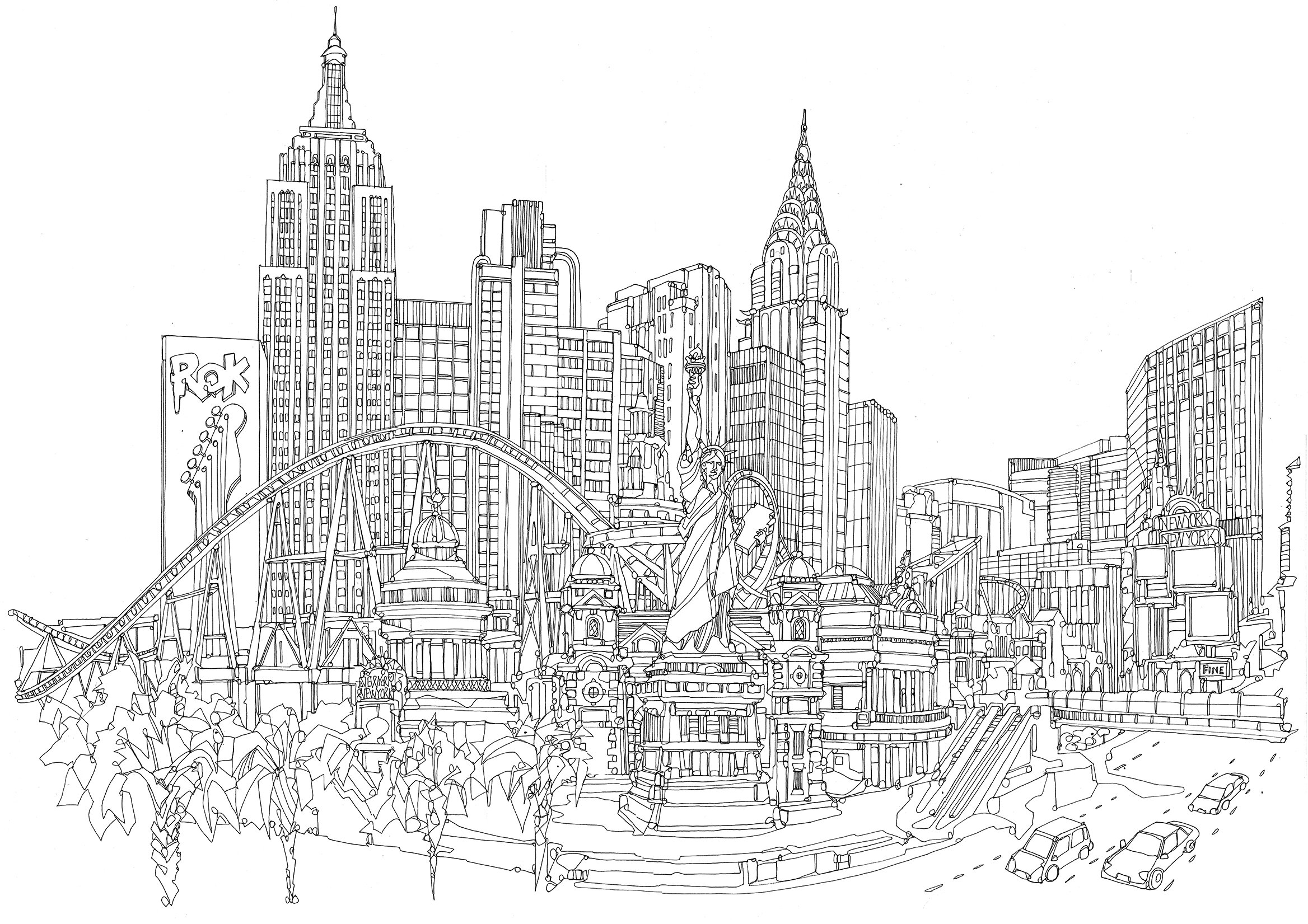
Las Vegas and Los Angeles
The latest line drawings I’ve been working on involve the city of Los Angeles in California and Las Vegas in Nevada and there are some interesting differences between the two places and how well they work as individual illustrations
You can see both drawings below (Los Angeles is on the left and Las Vegas is on the right) and although both work fine as stand alone drawings, I’d like to extend each of them with additional panels to turn them into panoramic drawings. What was interesting about both pieces was that Las Vegas was - I felt - more immediately identifiable from just the buildings alone whereas Los Angeles needed the context of the mountains in the background to make it clearer which city it was and is probably still fairly ambiguous regardless.
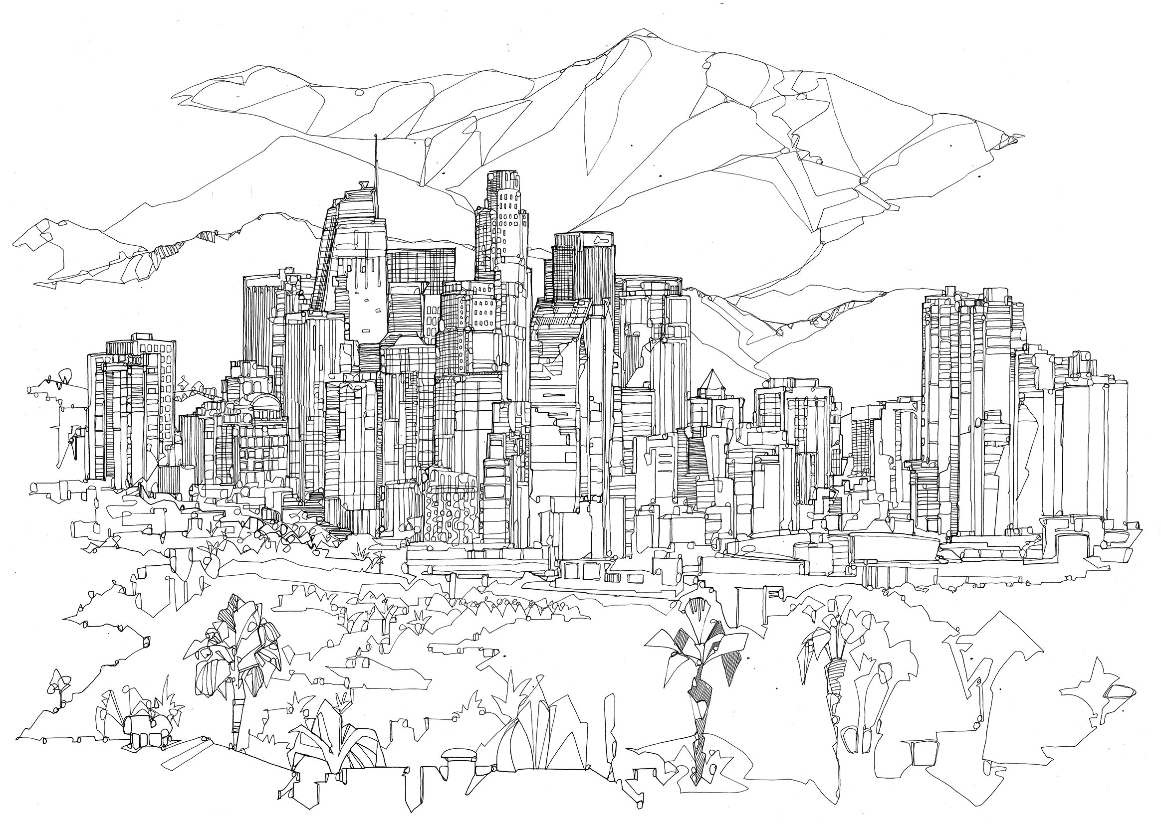
I’ve been commissioned to draw LA in the past and it’s a difficult city to capture, mainly because it consists of a number of extremely famous landmarks which are spread out over a wide area and vary hugely in size and style. The most successful approach I’ve found in the past is to work on a collaged piece - much like the drawings in the beer can illustrations I wrote about previously - and that is probably what I’ll try and do with the LA drawing; add additional elements like the Hollywood sign, LAX and other landmarks that immediately make the area recognisable to any casual viewer, a little like this drawing of California:

Pen and ink on paper.
Commission for Mr B & Friends.
With Las Vegas, I will probably add panels to either side that show a wider view and a more realistic depiction of the space, a little like this drawing of Dubai from earlier in the year:

Pen and ink on paper, 2020
I’ve been thinking a lot about cities and their visual identity after showing a few pieces to people and being surprised by which places they spotted straight away and which were harder to identify. With an illustration, it’s crucial to get the point across to the viewer in a clear and concise way and there are definitely pieces of mine which can be improved in this regard.
Other points I’m considering while I try to develop my work further involve varying the levels of detail which is something I’ll be looking at in my next post.