Berlin
I spent some time at the weekend working on some drawings of Berlin, which wasn’t what I’d initially planned to do but I’d been thinking a lot about the best way to draw cities in terms of how instantly identifiable they are to the casual viewer and Berlin is a city I struggled with in the past, possibly because I’ve not been commissioned to draw as frequently as other European cities.
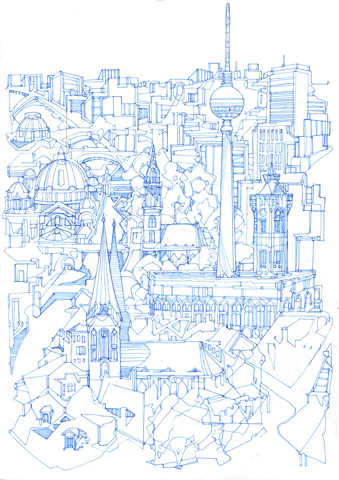
Past drawings of Berlin can be found via my city illustration site for anyone interested in those. For the recent pieces I decided to try working on something from a portrait perspective where the layout was slightly less literal than the aerial and panoramic views I’d drawn before and consisted more of the more famous/historical buildings highlighted with the contemporary buildings used as a semi-abstract background, more to give a sense of the type of architecture than a literal depiction of every building in the correct location. I wanted to create a drawing that would work well as a travel poster or a book cover and to develop a style that can be used to highlight specific types of architecture within a city as one flaw with a lot of my city drawings (from a commercial sense) is that they focus on views or areas that I find structurally interesting but which might not be the best way of getting across the overall feel of a place. One thing I like a lot about commissioned work is the chance to approach a city from someone else’s perspective rather than my own.
Anyway, the first drawing I made was this:

Berlin
Pen and ink on paper. This draft was a little rushed because I wanted to get the general idea down so some sections the drawing isn’t great and there’s some imbalances and stylised areas I’m not too keen on.
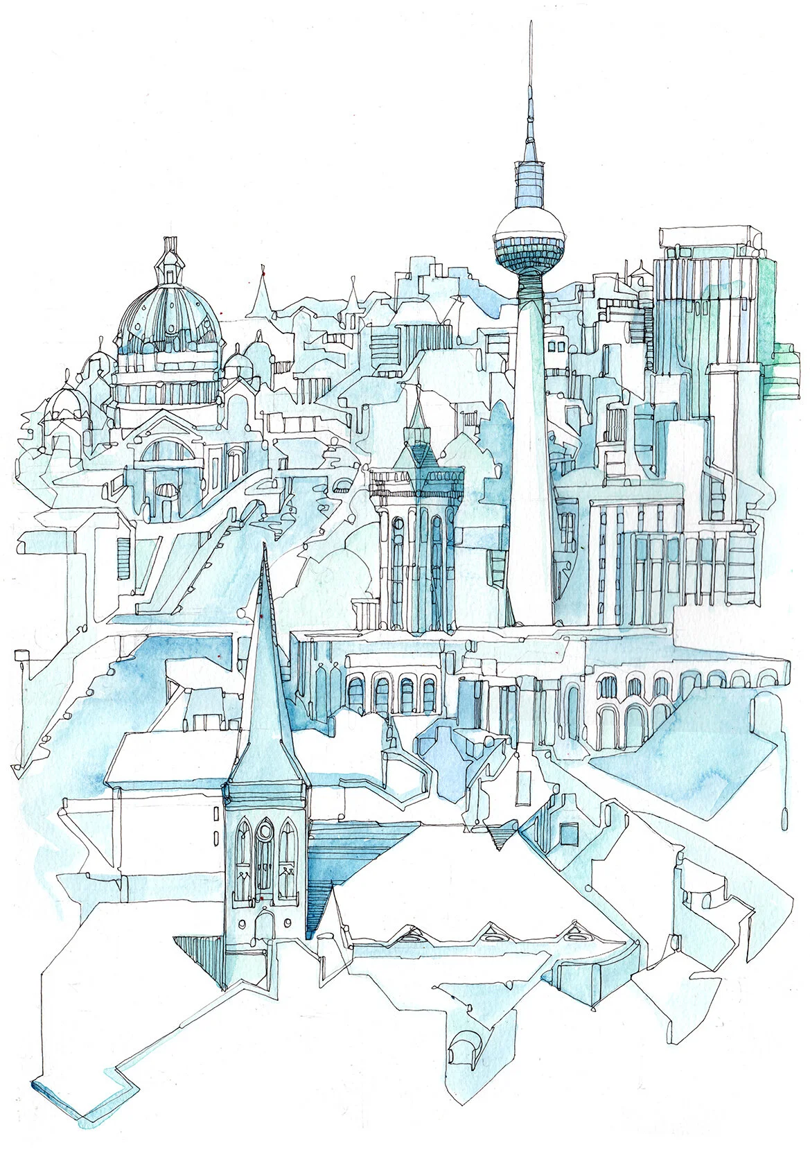
Watercolour Draft
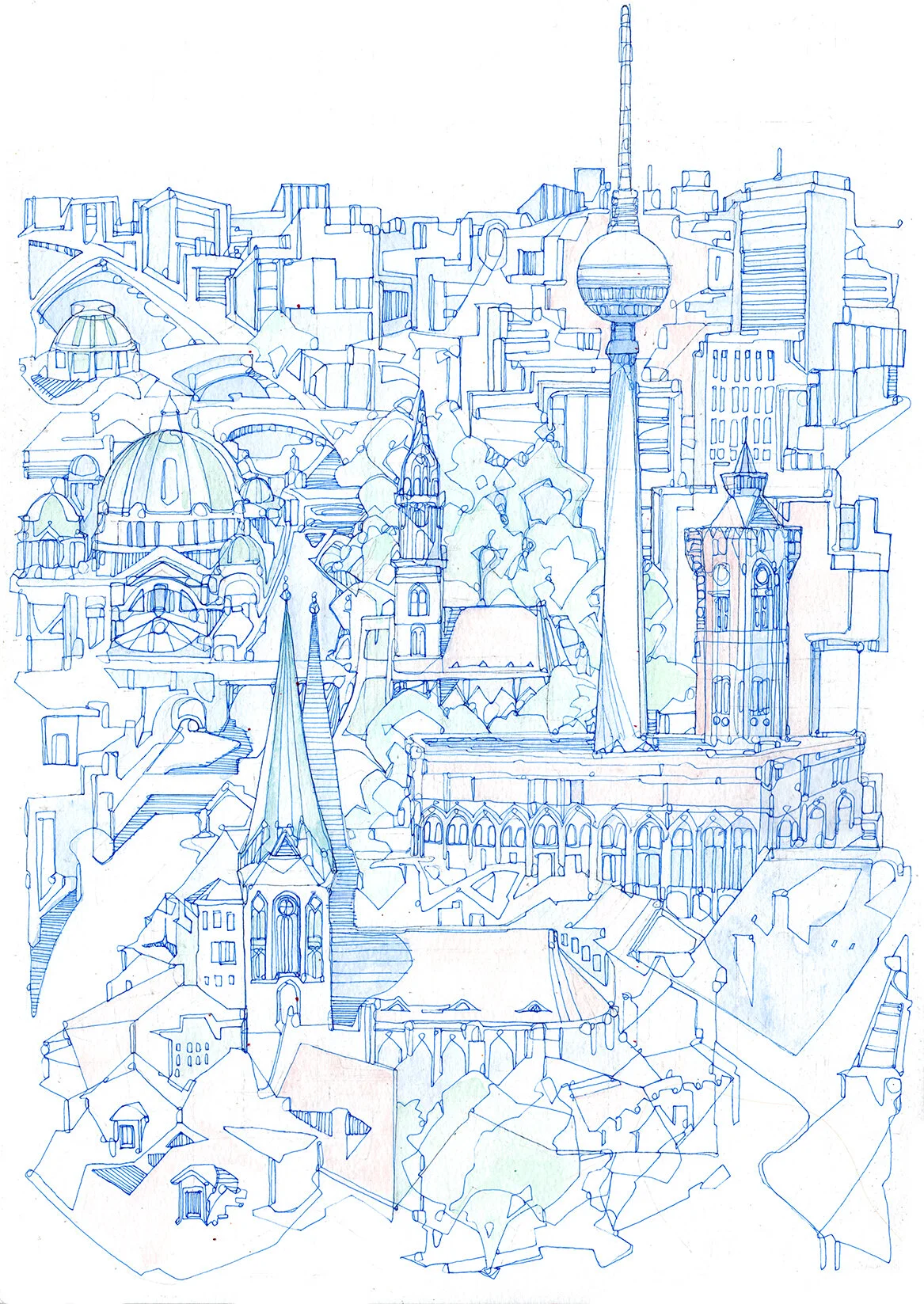
I added some watercolour to this version since it was a basic sketch. Then I decided to start drawing the layout again, introducing a few ideas that came up while I was making the first sketch.
For the next draft I worked in blue line because I’m still not entirely sure how these are going to work and blue line seems to be more favourable if you draw too much or add too much shading than black ink.
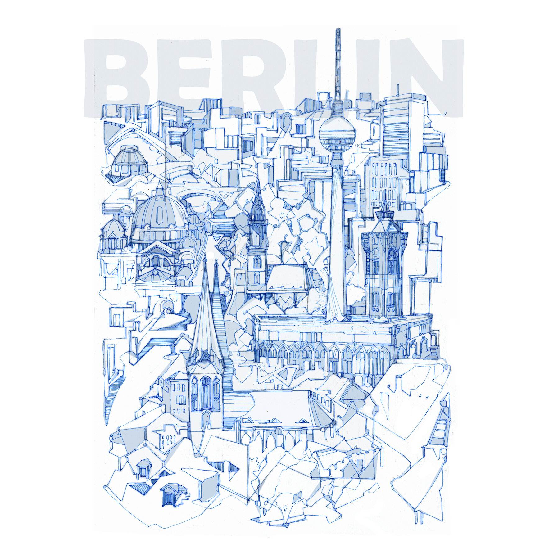
Once I’d drawn out a new design I tried it out in photoshop with some light colouring and lettering and added some watercolour to the original - next step will be to try the lettering hand drawn and coloured and to work on a couple of other cities in this style.